Always Excel has been used as a tool by end users for BI analysis in a self-sufficient fashion. The biggest problems with Excel are its limitations in size of the data that can be stored and the complexity of BI analysis that can be performed. For those reasons, when the end user is facing such limitation, he/she needs to get help from the IT department. This ultimately leads to the typical problem in which IT must to assign IT staff to analyze the requirements with the user, and then continue with technical specifications and finally build an application.
The good news is that if you use Excel 2010 you can download the free PowerPivot add-in and the Excel limitations previously mentioned will be solved. In that way you can start to enjoy an excellent tool to do Self-Service Business Intelligence.
What is PowerPivot?
PowerPivot for Excel has the ability to take the Self-Service BI to an unprecedented level. PowerPivot exploits the familiarity of Excel while adding a powerful BI analysis engine, along with new data compression algorithms that let you load large data sets in memory. PowerPivot technically is the implementation of Vertipaq, now with the new name xVelocity, which is defined as In-Memory Analytic Engine.
With PowerPivot users can process huge amounts of data at an incredible speed. Using Data Analysis Expression (DAX new language) in addition to the standard features of Excel, advanced users can easily create more complex applications based on relationships between tables in a database from different origins and other sources such as Excel spreadsheets maintained by you at your computer. In many cases, PowerPivot for Excel can establish relationships between tables automatically, and when it is not possible you can easily set up the relations.
Praxis
To illustrate all this, the following is a case studio tested with a database that includes a table of 10,000,000 transactions (TxMaster), and three related tables: Product Categories (ProdCat) Products (Prods ) and Locations (Stores). All these tables are maintained in a SQL Server database.
Let us start with the end result achieved after establishing a connection to a SQL Sever database to load the data, setup the table’s relationships, and finally assemble the analysis report, graphics and filters (Slicers).
 Final Result : Excel Dashboard
If we look at new things in the Excel Ribbon section, we can see the PowerPivot tab and as first option on the left side the PowerPivot Window item. If you click on the latter you are switched to the new section of PowerPivot, which is really where is performed all the handling of data to be used by the Excel spreadsheet via a Pivot Table.
In the next picture we have selected Data View, in particular TXMaster table with 10 million transactions (loaded into the computer memory, in this case a modest Notebook with Intel Core Duo and 4Gb memory). In the tabs above you can navigate through the rest of the related tables.
 PowerPivot Window – TxMaster Table
Note that you can add columns to any table loaded. Just point under Add Column and then enter the formula. The formulas are similar to Excel formulas, however the variables are referencing the fields names in the tables and not cells in particular. Additional you can use the new language DAX for more specific calculation. We can see more details of the DAX in a future post.
The table below shows the Product.
 PowerPivot Window – Products Table
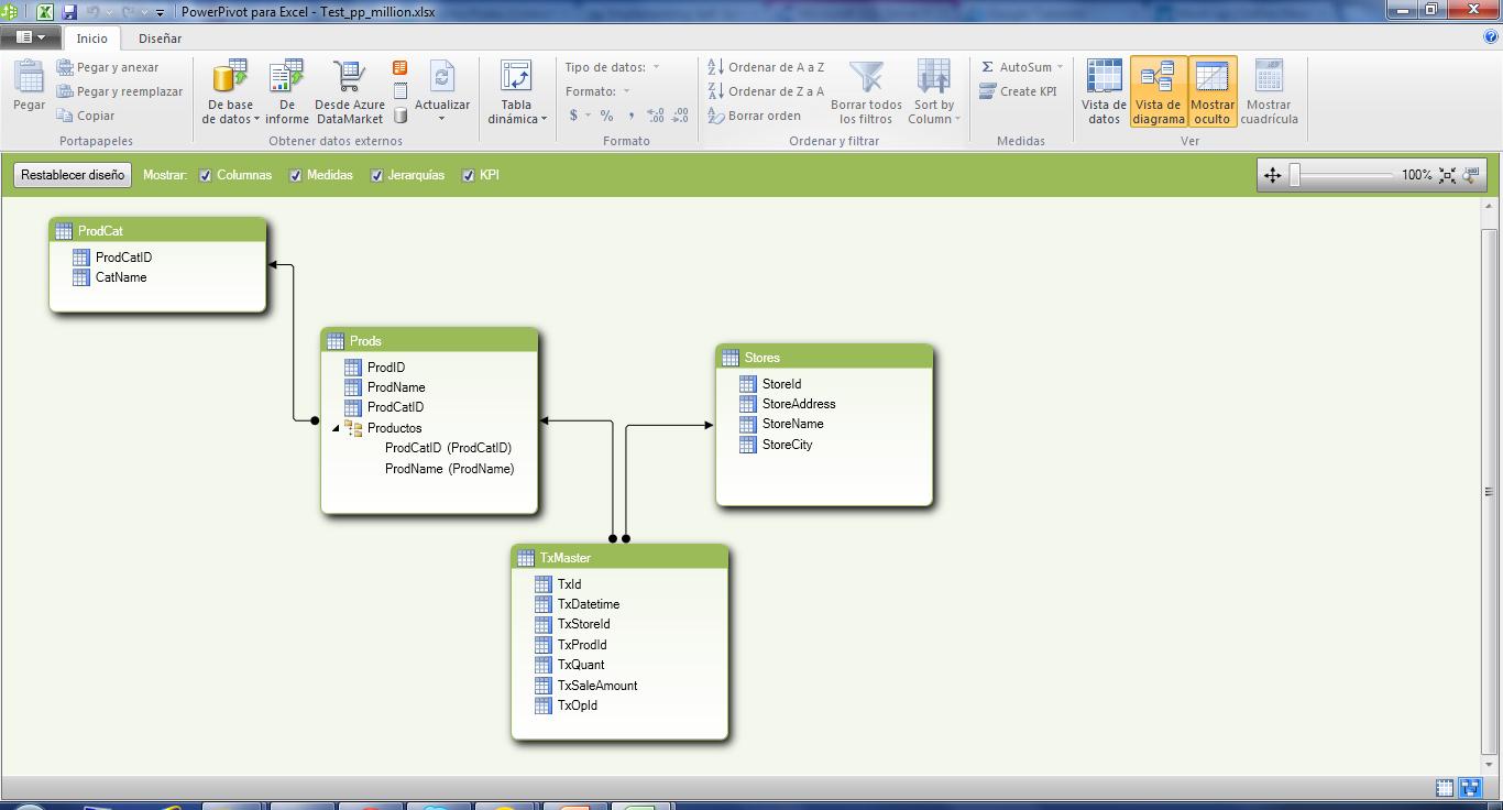
If you click on Diagram View you will see the diagram with the relationships between the tables we are using.
 Power Pivot Window – Diagram View
It is interesting to note that in this diagram you can do a lot of things, for example, create hierarchies as in the case Category / Product. Also, among other things, you could define KPIs, and most importantly in the Get External Data section, you can add data from virtually anywhere (SQL Server, Oracle, DB2, etc.., Etc..).
If we return to the Dashboard, this was created using Pivot Table, applied to the data defined in the PowerPivot window.
In this dashboard there are four important elements to highlight. The first one is the PowerPivot Field List, i.e., the set of measures and dimensions for the analysis of our cube, which is displayed automatically when you create the PivotTable. We will not go into details of how to assemble the table and graph analysis, but this is achieved by simple drag and drop fields from the tables on the sections of Row Labels, Column Labels and Σ values.
Regarding the Excel file, this can take a lot of space, since all data in your tables will be stored in the file. However, PowerPivot has very good data compression ratio, in this case the final size of the Excel file was approximately 62% of the size occupied by the tables in SQL Server.
An important item is to indicate that everything that was defined in PowerPivot is not lost when you need to update your information, that is, re-loads the data sources to incorporate either new records or data updates in the tables. PowerPivot will apply the already defined data relationships and then re-calculate all the aggregated columns and will update all the information for a fresh analysis.
Well, to finish just add that this is a sample of what you can do today with PowerPivot for Excel, without going into further details. As you can see, PowerPivot is a real opportunity to enter the world of Self-Service Business Intelligence (SSBI).


